
All ArticlesDesign Tutorials
Design Masterclass: Placement, Contrast, and Sizing for Custom Apparel
Learn the golden ratios for chest logos, full back graphics, and sleeve hits to design apparel that looks balanced, stylish, and retail-ready.
S
Sarah Jenkins - Senior Design LeadApparel Production Specialist
October 22, 2026•2 min read
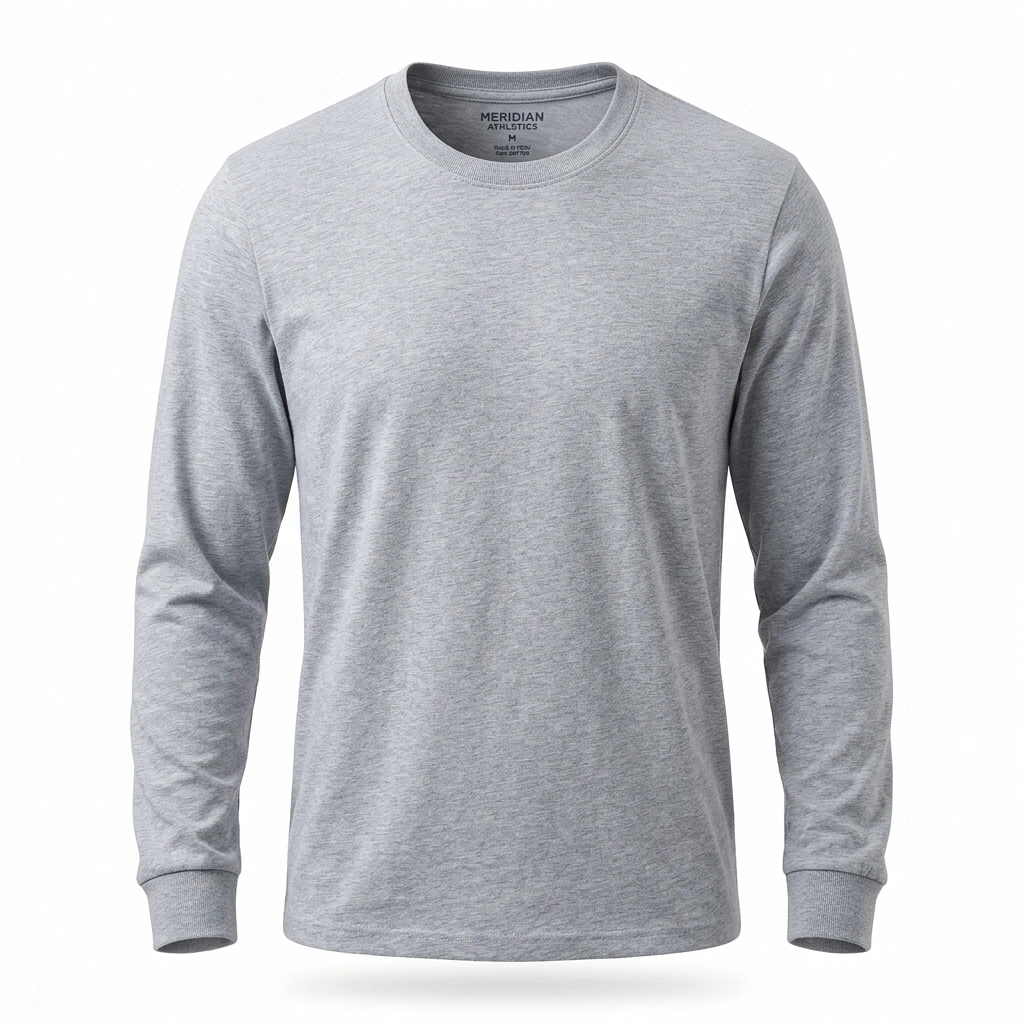
Designing Professional Custom Apparel A great t-shirt design isn't just about good graphics — it's about visual harmony between print placement, graphic dimensions, and fabric contrast.#
1. Print Zone Golden Ratios * **Left Chest (Pocket Hit)**: 3.5″ to 4.5″ wide. Place 2.5″ to 3″ below the bottom collar seam, centered between the placket and left shoulder seam. * **Full Front Graphic**: 11″ to 12″ wide by 14″ to 16″ high. Start 2.5″ to 3″ below the front neckline so the artwork rests naturally across the sternum. * **Full Back Streetwear Print**: 12″ x 16″ maximum DTF printable area. Position 3″ below the back collar to create high-impact streetwear aesthetics. * **Sleeve Print**: 3″ to 3.5″ wide by 10″ to 14″ long down the forearm for long sleeves, or a 3.5″ circular hit on short sleeves.
2. High-Contrast Color Selection When working with dark blanks (Black, Deep Navy, Dark Heather Charcoal), contrast is essential. White, cream, bright orange, and cyan pop with striking vibrancy. Test multiple colorways instantly using our real-time 3D garment color switcher before placing your order.
Tags:#Apparel Design#Print Placement#Streetwear#Typography
Put Learning Into Practice
Start CustomizingDesign High-Resolution Custom Merch
Start designing directly on real garment mockups with our real-time 3D Studio Customizer.